Color Temperature
Color temperature is a fundamental concept in art and design, influencing how we perceive and interact with colors. It’s not just about labeling hues as warm or cool; it’s about understanding the subtle undertones that give colors their unique characteristics. This knowledge is crucial for artists, designers, and anyone interested in the visual arts, as it affects color mixing, composition, and the overall mood of a piece.
WTF is Color Temperature
At its core, color temperature refers to the warmth or coolness of a color. Traditionally, colors like reds, oranges, and yellows are considered warm, evoking feelings of heat and energy. In contrast, blues, greens, and violets are seen as cool, and often associated with calmness and tranquility. However, this classification isn’t set in stone. Within each hue, there are variations that can lean warmer or cooler depending on their undertones.
The Role of Undertones
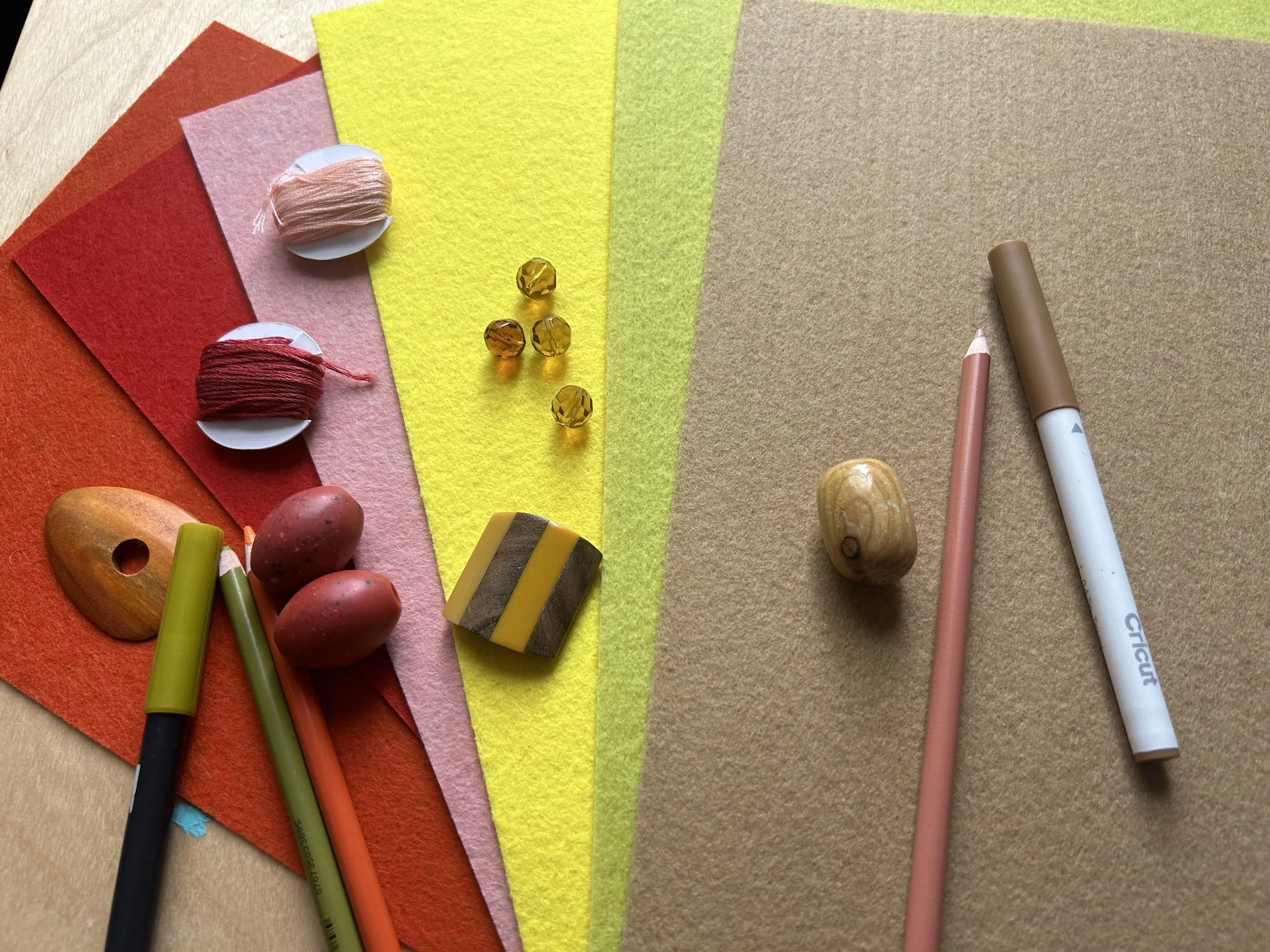
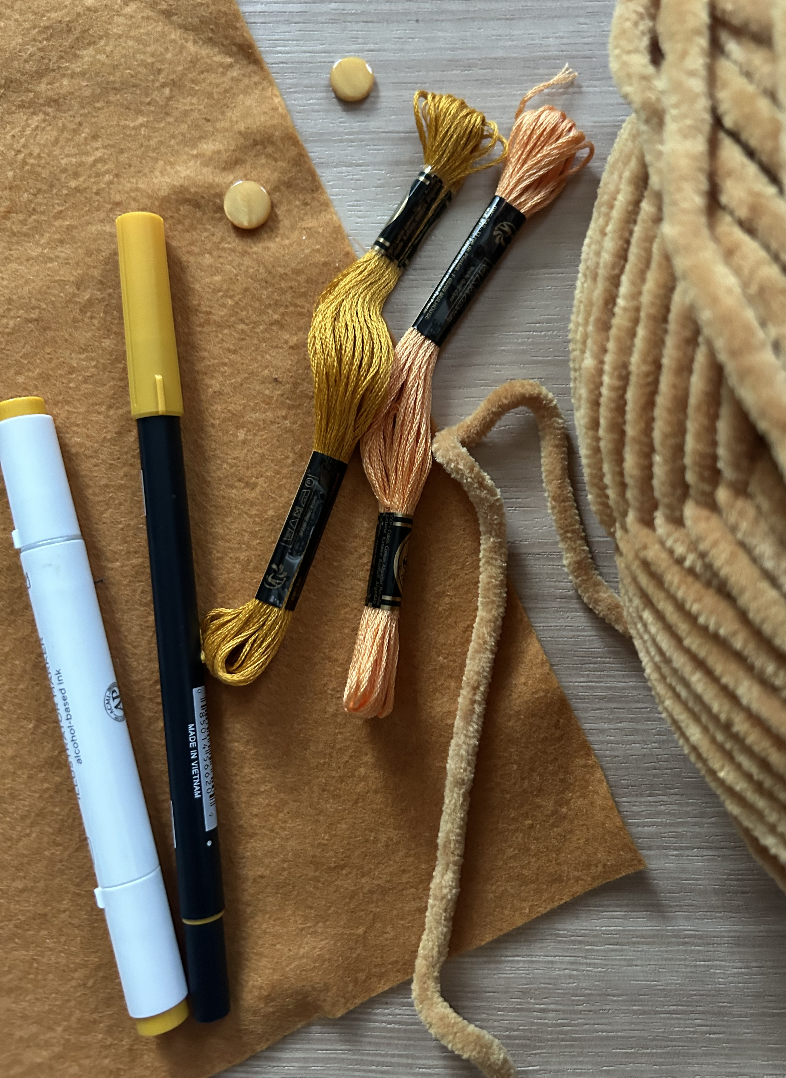
A collection of craft supplies with warm yellow undertones.
Undertones are the subtle hues beneath the main color that influence its overall temperature. For instance, a red can have an orange (warm) undertone or a blue (cool) undertone. A red with orange undertones might remind you of autumn leaves, radiating warmth, while a red with blue undertones resembles the deep tones of red wine, offering a cooler appearance. Similarly, yellows can range from the warmth of a golden sunflower to the cooler tint of a lemon. Blues, typically cool, can possess greenish (warm) undertones or purplish (cool) undertones, affecting their placement and use in art.
If you have ever heard of “seasonal color analysis, " you may already know about undertones. Seasonal color analysis combines skin tone temperature + hair color + eye color to classify the combinations into a season (winter, spring, summer, autumn). Clothing and makeup colors are then recommended based on the seasonal classification.
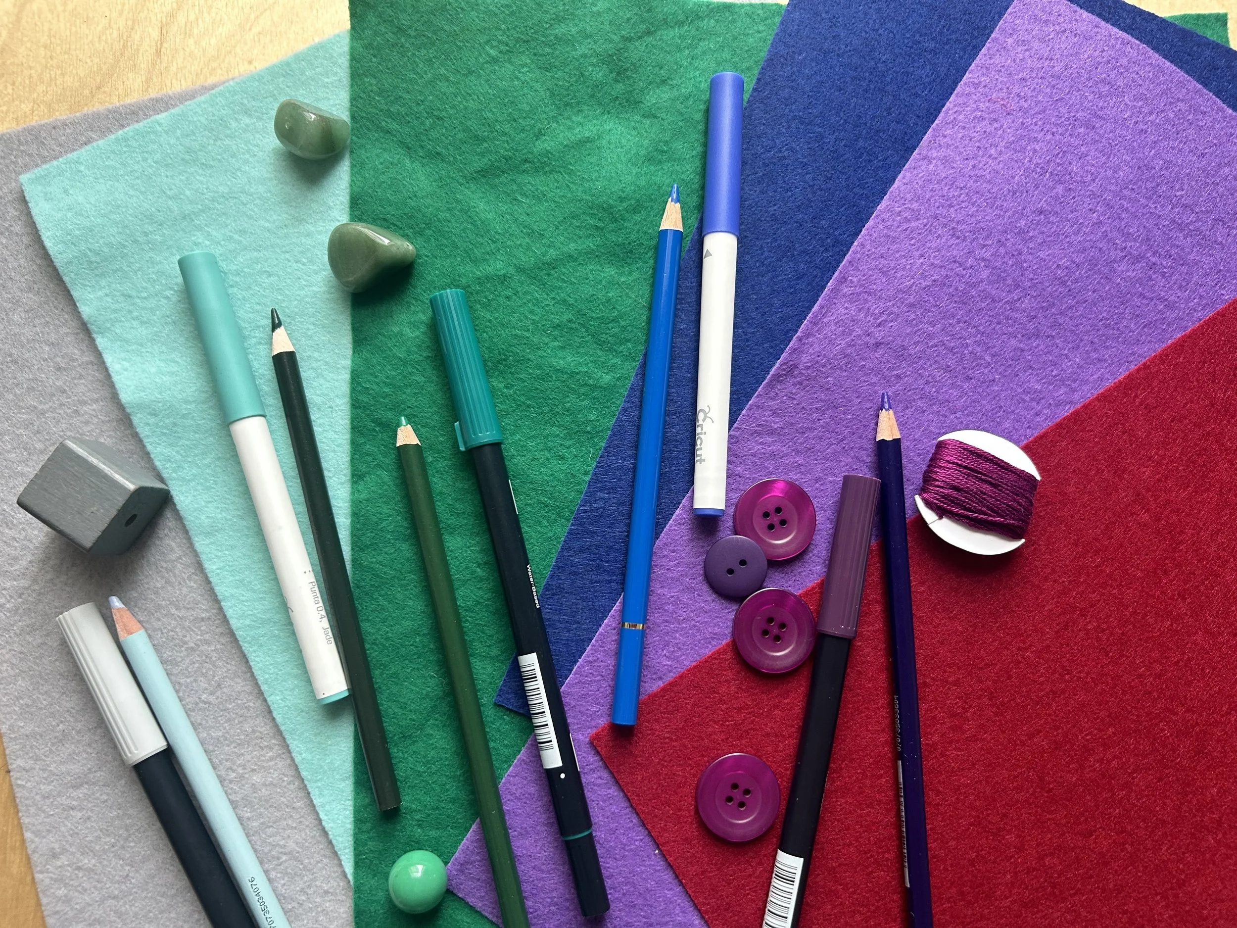
A collection of craft materials in cool colors.
The Temperature Equation
Understanding color temperature is vital when mixing paints or other mediums. Combining colors of the same temperature—warm with warm or cool with cool—tends to produce vibrant and clean results. For example, mixing a warm yellow with a warm blue can yield a lively kelly green. On the other hand, mixing warm and cool colors can lead to muted or “muddy” outcomes. This happens because the contrasting undertones can neutralize each other, reducing the saturation and brightness of the resulting color.
Warm Color + Warm Color = Warm Clean Color
Cool Color + Cool Color = Cool Clean Color
Cool Color + Warm Color = Muddy Color
How Creatives Do It
Artists often use the concept of color temperature to create depth, mood, and emphasis in their work. Warm colors tend to advance, making them ideal for focal points, while cool colors recede, providing a sense of background or distance. This technique can be observed in various art forms, from masterful Impressionist landscapes to modern thread painting.
For instance, in portrait painting, an artist might use warmer tones to highlight areas where light hits the subject directly and cooler tones in the shadows, adding dimensionality and realism. In interior design, balancing warm and cool colors can create a harmonious and inviting space. A room with predominantly cool tones can be warmed up with accents like orange cushions or a red rug, achieving a pleasing equilibrium. Something to think about if you are tired of Millennial grey.
Light It Up
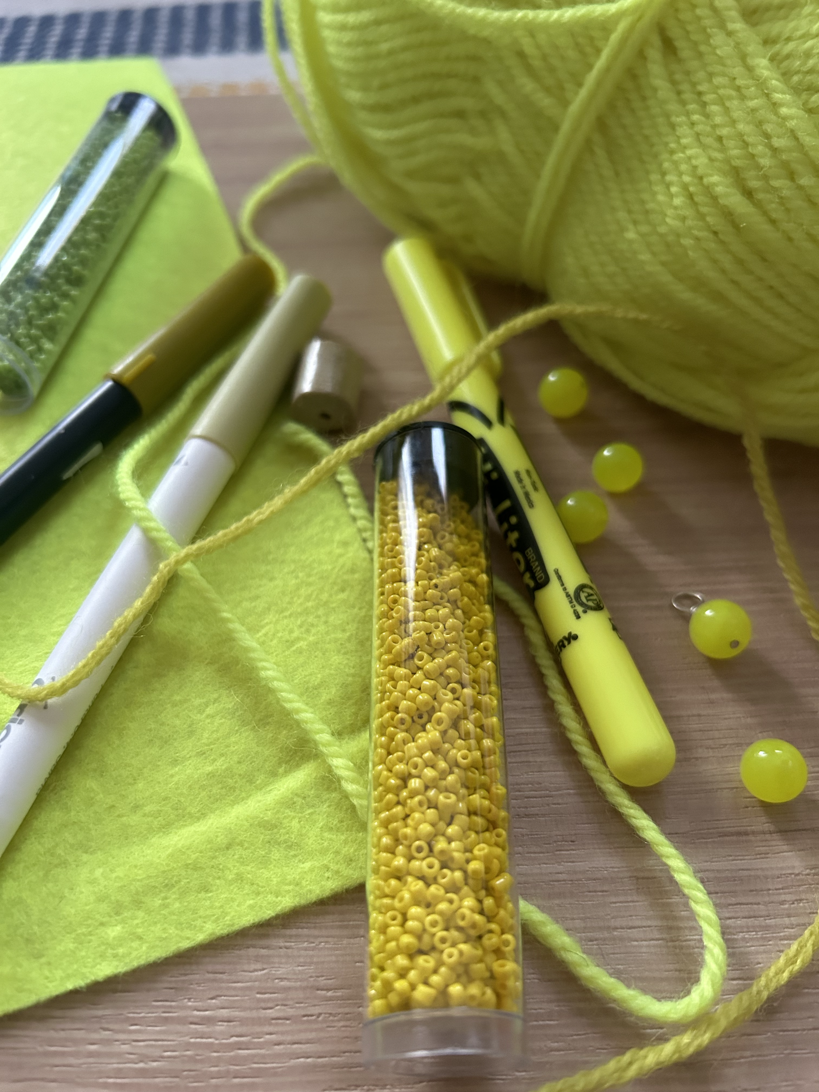
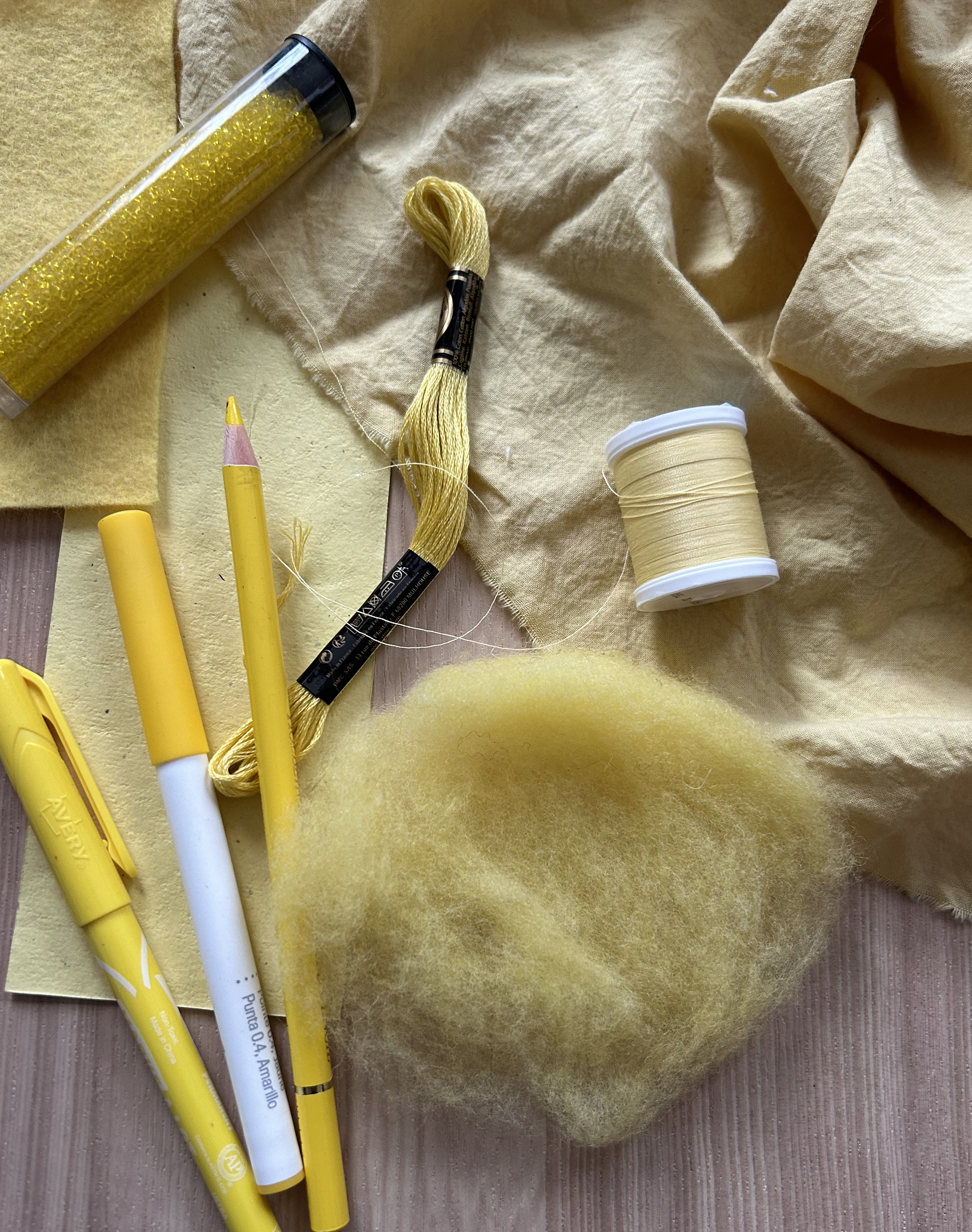
Craft materials in varying cool shades of red, yellow, and blue. The materials have cool undertones that work well together in this photo.
Lighting plays a significant role in how we perceive color temperature. Natural light changes throughout the day, shifting from the warm hues of sunrise to the cooler tones of midday, and back to warm during sunset. One of the benefits of artificial light is that it can be a reliable light source that remains constant. Of course, there are many options with artificial lights. For example, incandescent bulbs emit warmer light and fluorescent lights often cast cooler tones. If you ever purchased an unflattering item by mistake after a trip to the store fitting room then it was probably due to florescent light. Creatives must consider these factors, as the same color can appear differently under various lighting conditions.
Mastering color temperature involves more than memorizing which colors are warm or cool. It’s about recognizing the subtle undertones within each hue and understanding how they interact. This knowledge empowers artists and designers to make informed decisions, ensuring their color choices align with their creative intentions. By appreciating the nuances of color temperature, you can enhance the visual impact and emotional resonance in your work.


