My New Booth Design
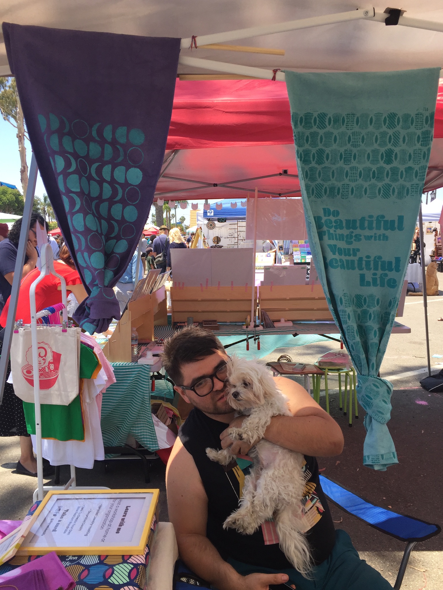
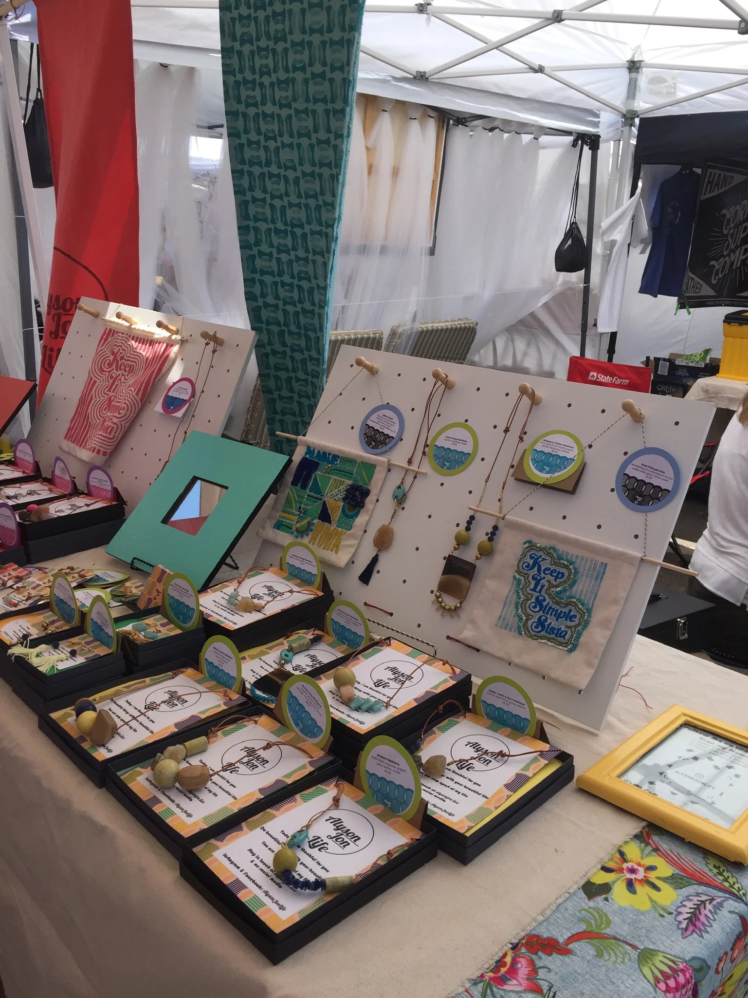
As promised in a previous post, I am sharing photos of my booth at Patchwork Show in Long Beach in June. I focused on making custom textiles to decorate my booth. Here are my textiles in action including my selfie worthy backdrop.
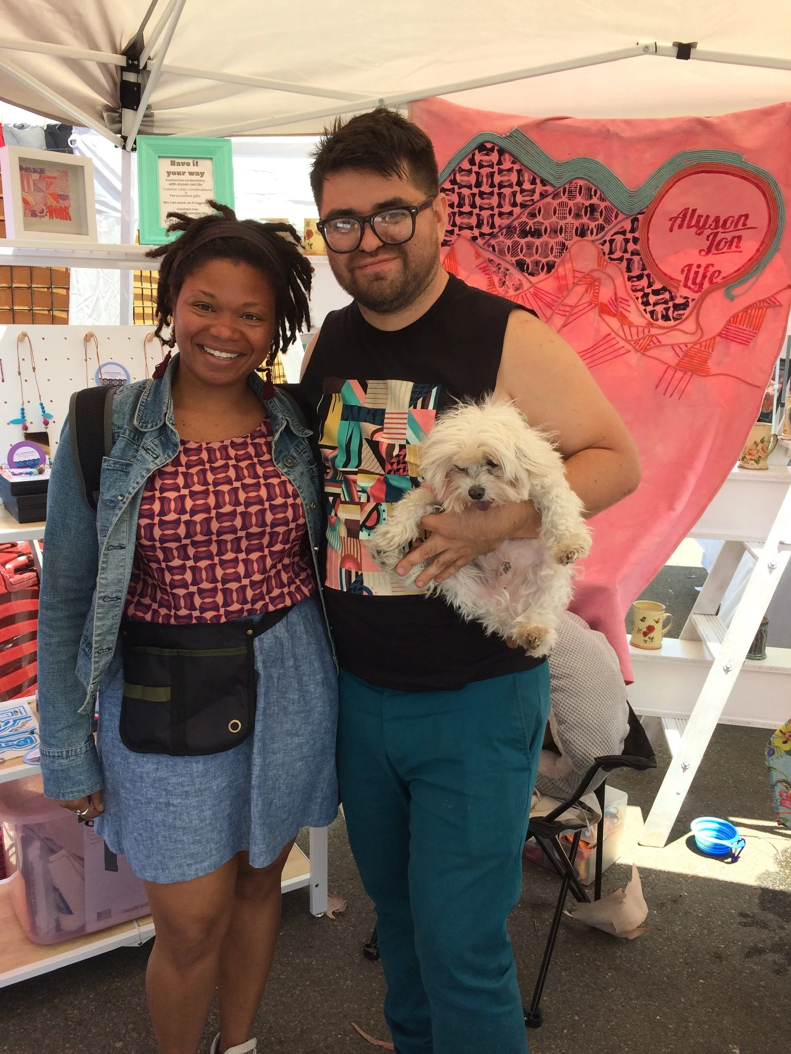
Standing in front of my custom made selfie backdrop with my partner, Angel and our dog child, Zeus.
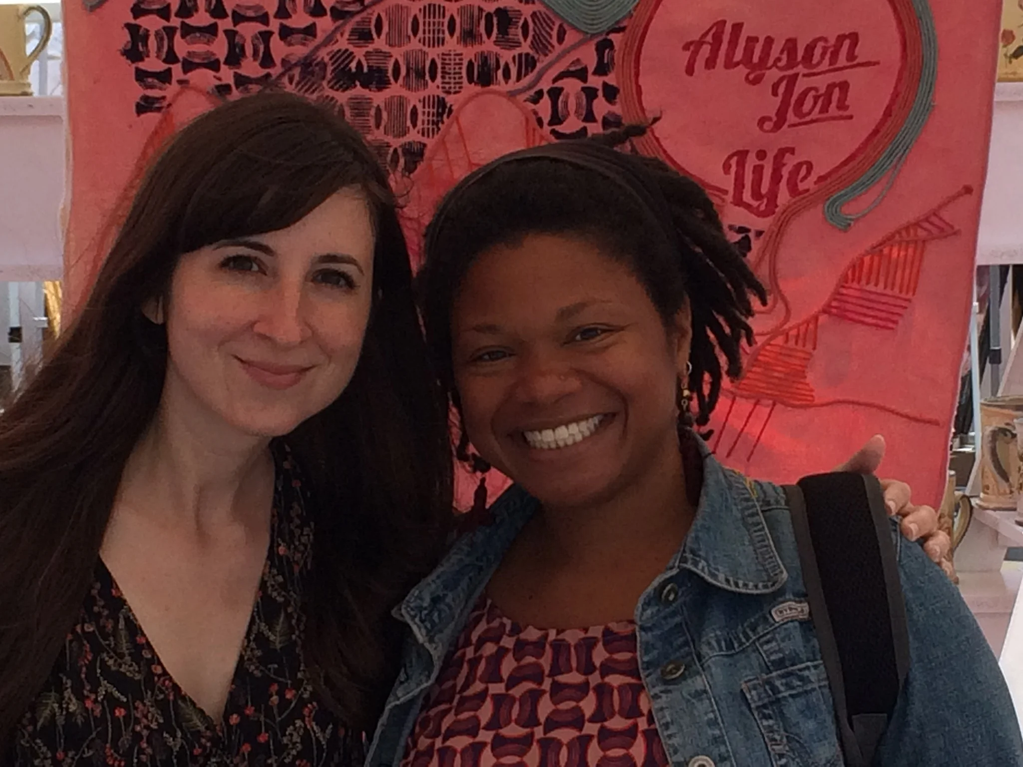
My friend Margaret and I try out the backdrop.
The backdrop features my logo as the sun over mountains. I hand-dyed the canvas fabric and cotton cording using RIT dyes. The colors weren’t 100% matching to my work but they were definitely in the same family. I wanted the banner colors to be light to keep my whole booth airy rather than claustrophobic. After everything dried, I used a stencil created with my Cricut Explore Air 2 to paint my logo onto the canvas.
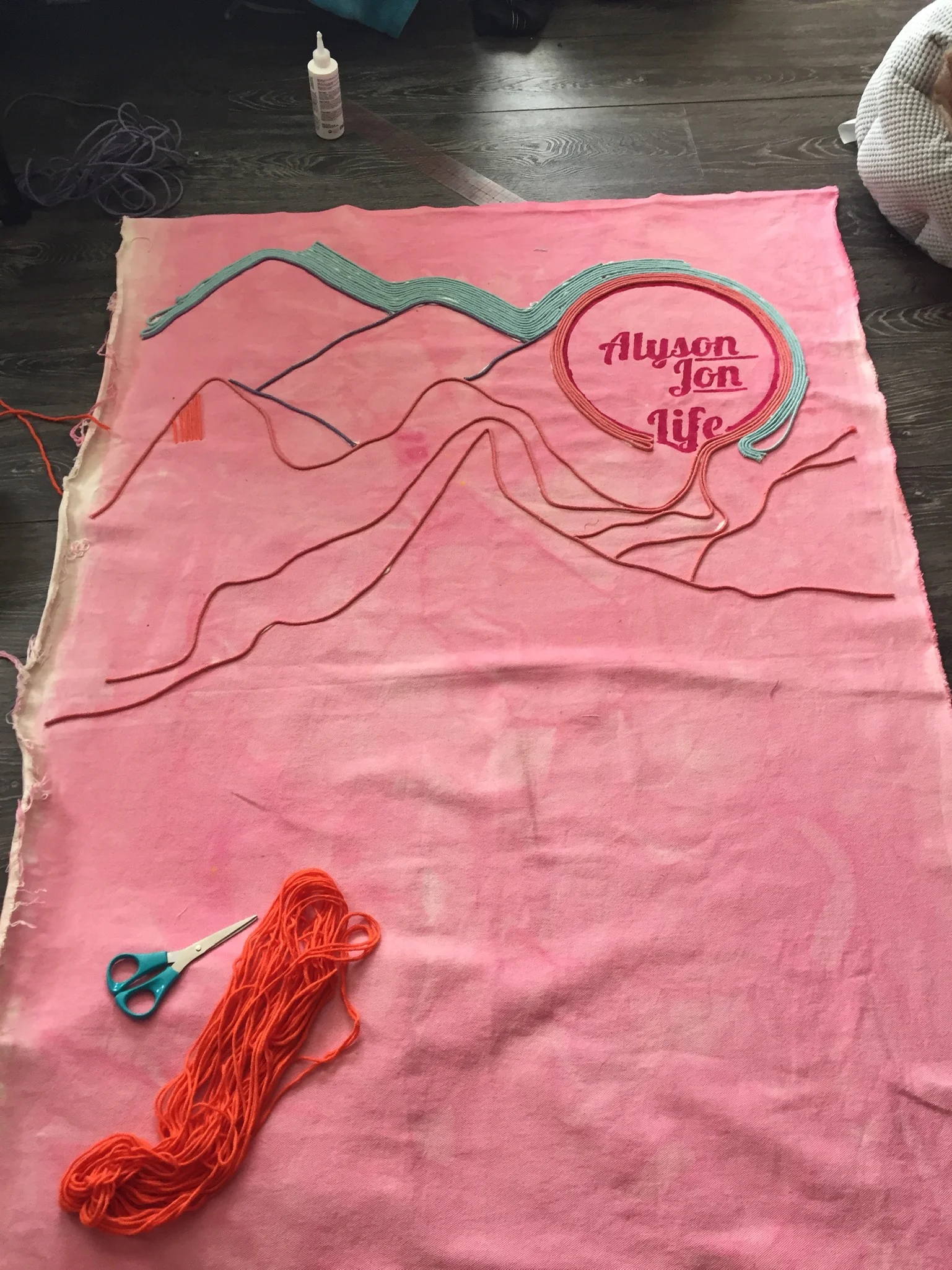
I started laying down the cording. I didn’t do an underdrawing or even a sketch. I just worked organically placing and gluing the cording down. Gem Tac was strong enough to hold everything down and it dried clear. I’m a big fan of Jackson Pollack’s process, so I would like to believe that I was channeling his work a bit as I leaning over my canvas splayed out on the floor of my house. I wrapped the logo with cording to symbolize radiating lines.
Work in progress.
I hurt my hands embroidering the canvas with yarn. Eventually I figured out to make the hole first and then thread the yarn through. Using another stencil and hand made stamps, I printed on the fabric. Clearly, I love a lot of pattern.
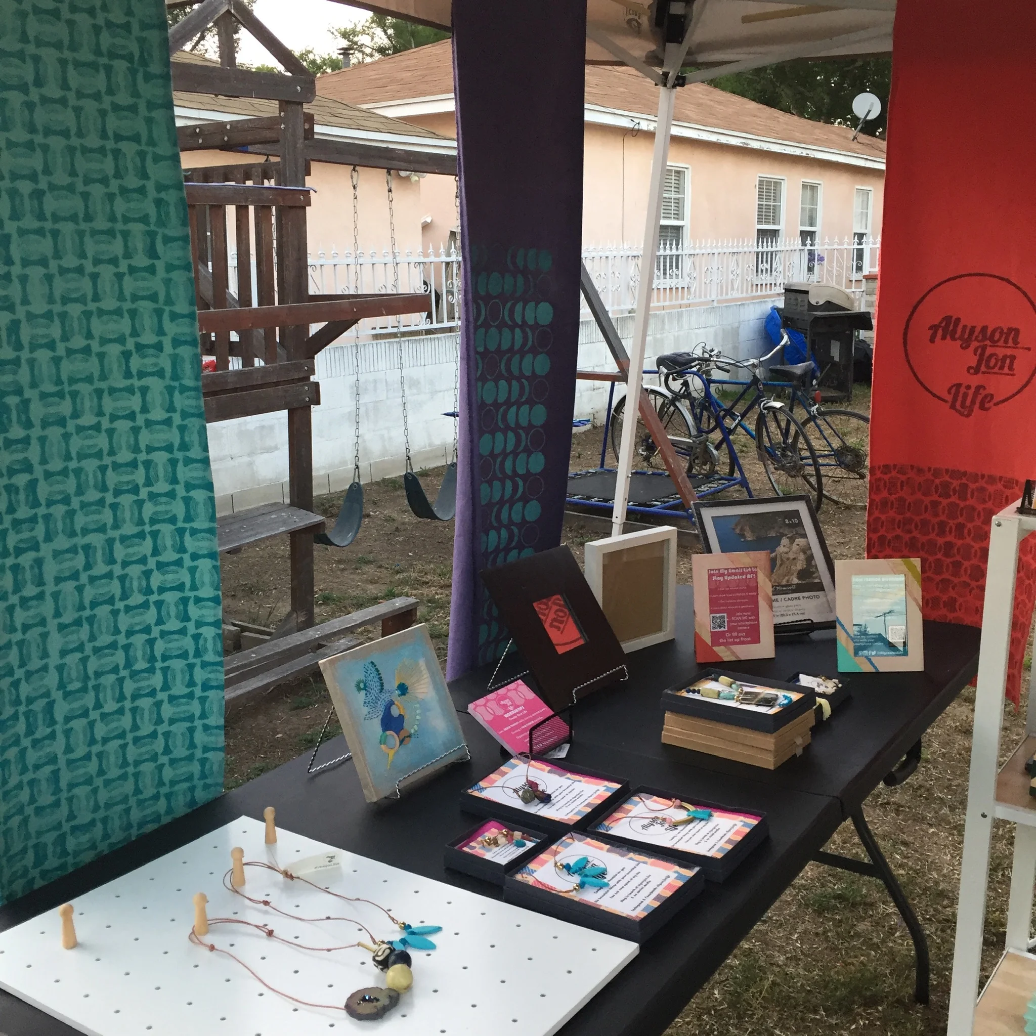
I also dyed and printed canvas banners. I had a ball creating these custom fabrics.
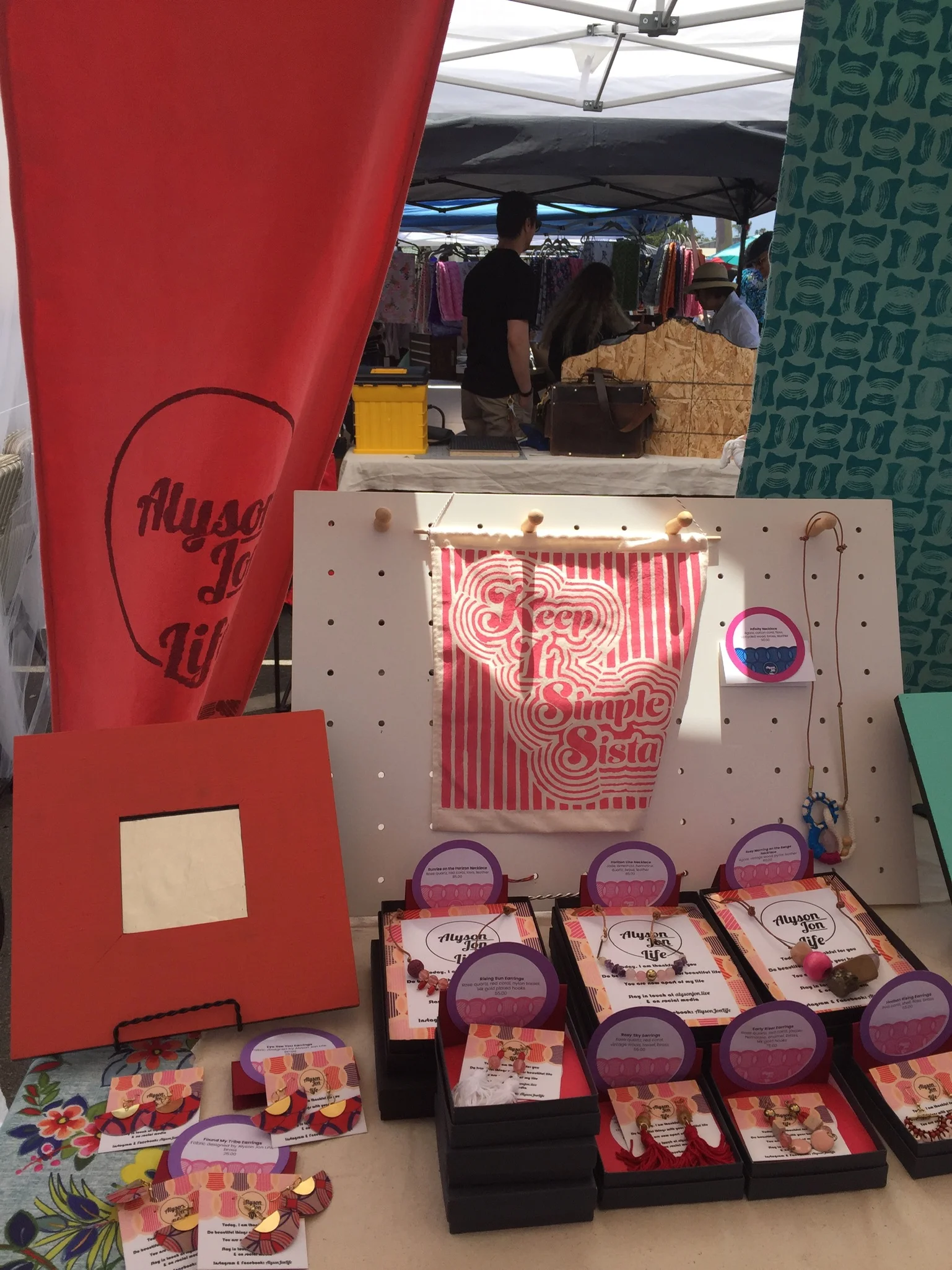
The handprinted banners custom made for the booth. The fabric is knotted because it was windy by the water at Patchwork Show in Long Beach.
They definitely made my booth noticeable while also showing off my surface design skills. I am looking forward to using this skills for custom projects in the near future.
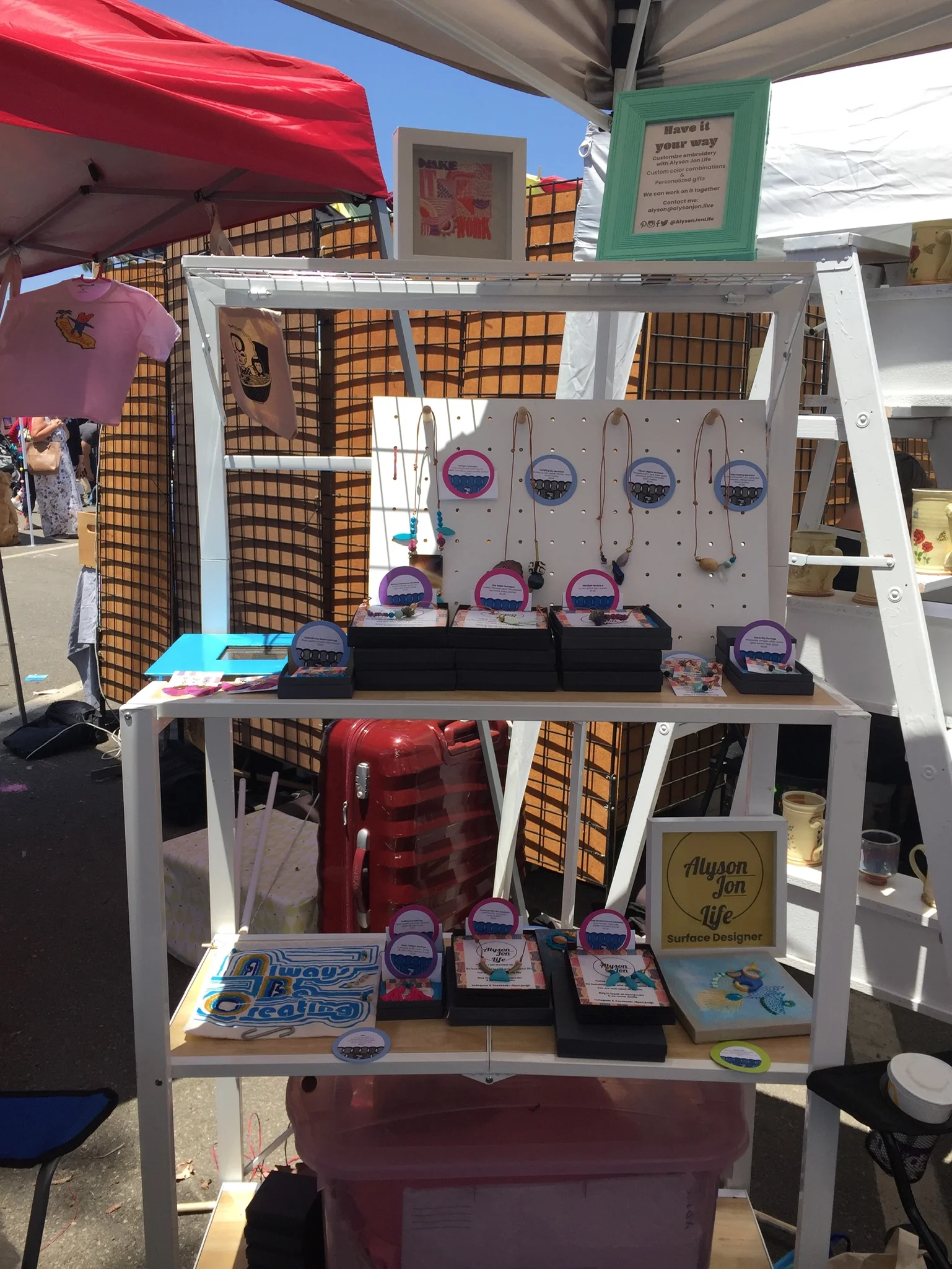
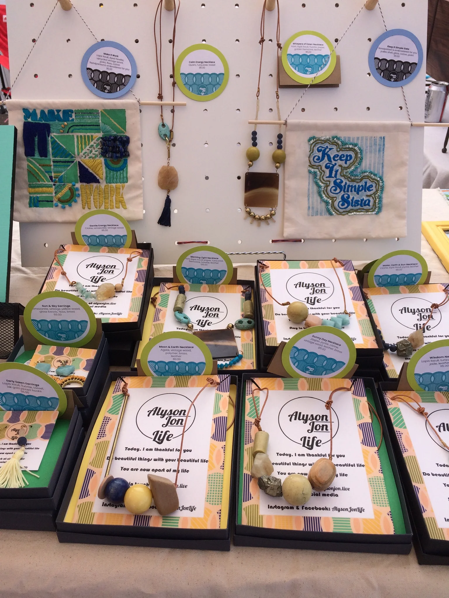
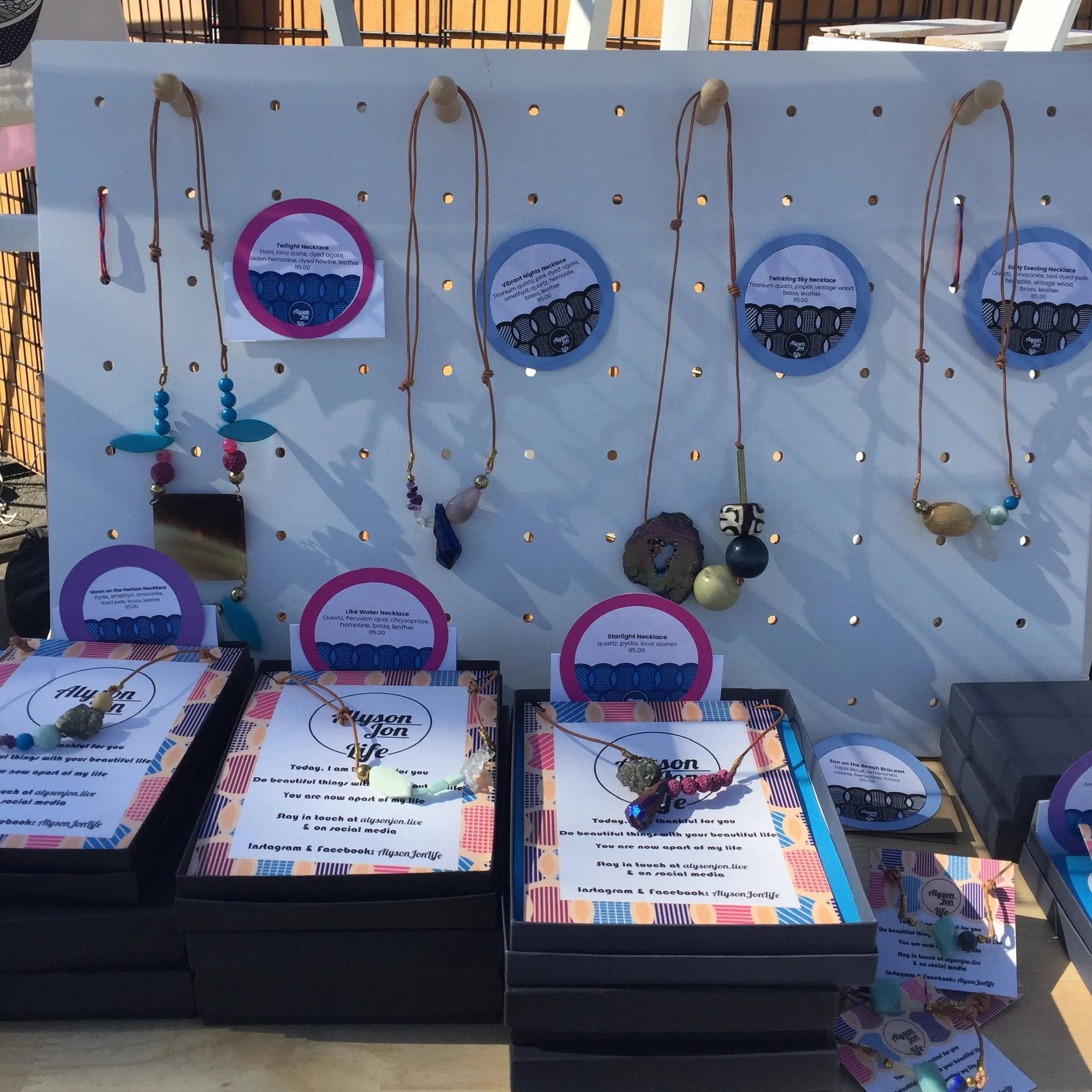
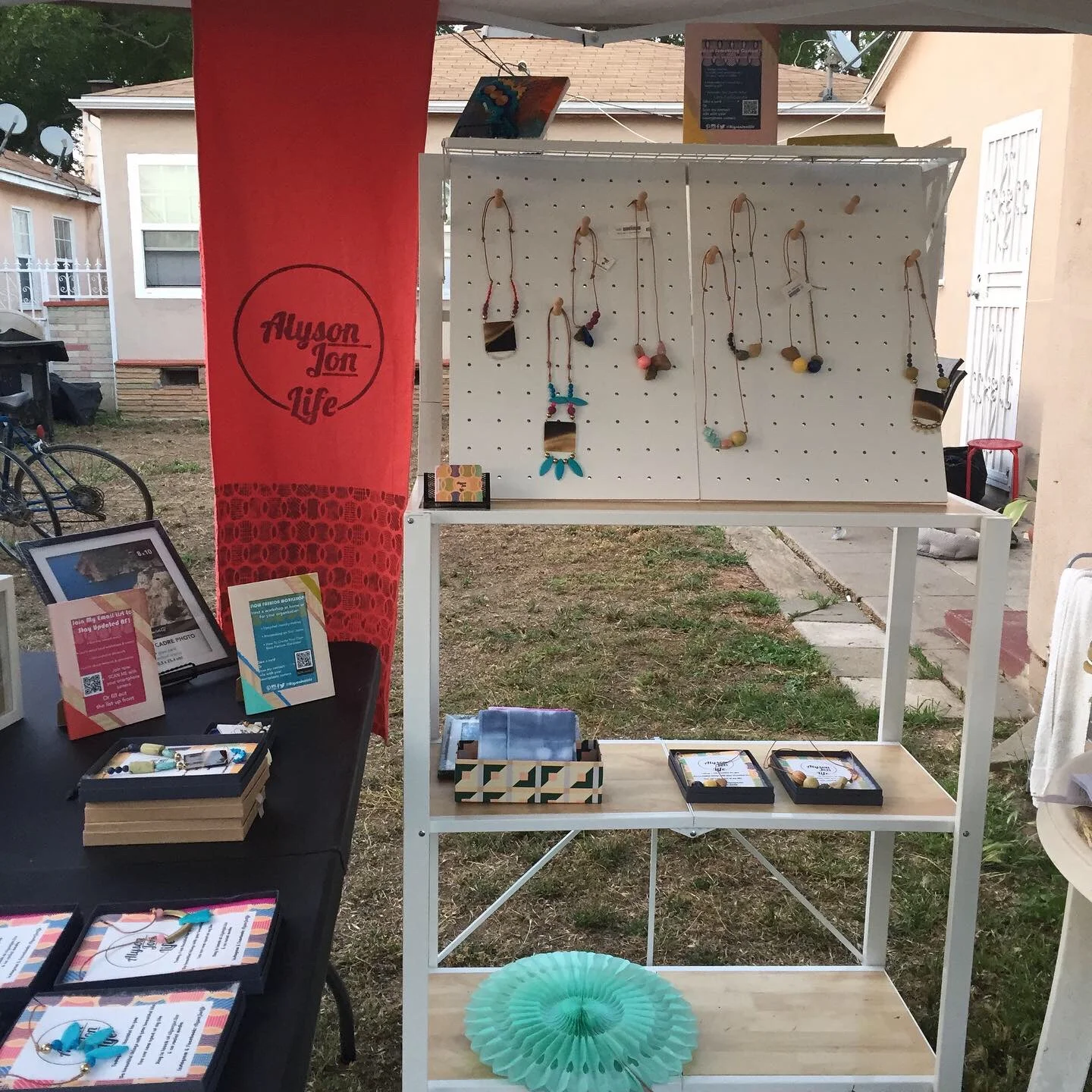
I found a folding shelf that is heavy but looks great. I used it to display my work which was mostly displayed in boxes. Small pegboards were a perfect hack for my long, adjustable necklaces which look great on people but are too cumbersome for most jewelry displays.
Surface design is closely tied to graphic design. I designed all my signage, labels and marketing materials. The pricing labels were simply made using Adobe Illustrator and Avery circle labels. I was able to use my Cricut Explore Air 2 to create cardstock stands for each price label. Each label included my signature print to tie in with my branding. Even though I use a variety of a media for my work, I wanted to make sure that everything was branded similarly for merchandising purposes. The signature print is also included in my packaging.
The signage was originally going to include my signature print. I painted the frames I had for a fun effect. Once I printed the signs with the signature print it all looked too cluttered. Quickly, I decided to go with a paired down version of my signs.
Designing this booth was a challenge because I had never designed an actual space before. There are some lessons I learned after I put the space together. For example, I will definitely use eyelets for the banners so that I can easily anchor them down. I learned a lot from this project and want to continue on working on more projects like this.
My new booth will be making another showing at Artists and Fleas in Venice on July 27. Read more about the event here.
My first “dress rehearsal” in my backyard.
Another photo of my “dress rehearsal” in my backyard. My handprinted banners in full effect.
